
From NYTimes.com: The “O” in Obama
Q: I have to ask, since many agencies that do political campaigns are simply “doing a job,” did you have strong feelings one way or the other for the Obama candidacy?
A: We were excited to work on the logo and energized by the prospect of Mr. Obama’s campaign. However, we didn’t pursue or develop the work because we were motivated exclusively by ideology. It was an opportunity to do breakthrough work at the right time in what’s become a predictable graphic landscape.
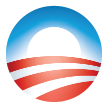
The Obama logo is a brilliant piece of artwork and an extremely important part in the branding of Barack Obama as “cool”, especially to younger voters.
Most political designs before this were generally generic patriotic symbols incorporated with a name. The “O” logo does so much more, capturing the essence of Barack Obama’s campaign, HOPE.
Having a logo also allowed for more flexibility in creating more attractive signs and logo related products.
No Comments