
I like the Ritz and Oreo packaging that I saw the other day at Target. It’s a much cleaner and simpler look with a design aesthetic. I especially like the word Oreo with each letter in a white circle, reminiscent of the white icing middle.
In contrast with the beauty of the new package, we have the old Double Stuf packaging on the right. Yes, it is spelled Double Stuf with one “f”.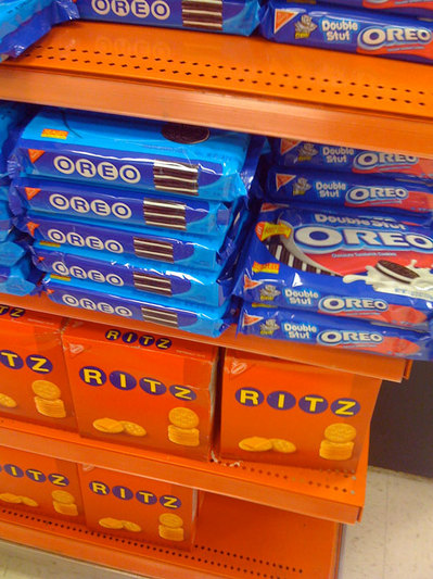 It looks like there may be a functional change behind the package redesign. It looks like you can open the Oreo package and reseal it by lift the tab on the top.
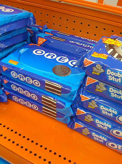
No Comments